Washington Sea Grant

University of Washington
College of the Environment

Select Page

Creating a Baseline Understanding of Washington Coastal Economies

The Washington Marine Spatial Plan was completed in June of 2018. The Plan provides guidance to evaluate potential new uses in the waters off Washington’s coast such as renewable energy, mining, dredged material disposal, marine product harvesting, and offshore aquaculture. During development of the Plan, it became clear that communities were particularly concerned about rural coastal economies and any adverse impacts to these communities from new uses. However, it would be difficult to identify any adverse impacts without first establishing some baseline knowledge and understanding of these economies.

In response to those concerns, Washington Sea Grant coastal economist, Kevin Decker, developed a website called The Washington Coast Economist. The site is intended to be an economic resource for coastal communities. It includes a blog section to discuss all things economics on the coast, a resources section to help identify resources that can assist with economic development, an economic studies section that serves as a repository of research and information on coastal economies, and an Economic Dashboard.

Interactive Data through an Economic Dashboard

The Economic Dashboard currently provides data on population, employment and unemployment, income, housing, and competitiveness. The Dashboard offers interactive maps, charts, and tables to organize and make sense of economic data. Users can choose to focus on a very narrow subset of data or gather a broader perspective. Most of the data on the Dashboard is available through public resources such as the Census Bureau or Bureau of Economic Analysis. However, community resources are stretched, and it is difficult for them to perform the appropriate analysis needed to gain insights that the data can provide. The Dashboard serves to bridge that gap and provide an interactive way to explore the data at various scales and topics. The Dashboard is specifically designed to help identify communities’ socioeconomic strengths and weakness, which can then be utilized to address those concerns and provide support for funding requests.

An Example: Population Change

As an example, let’s take a look at the population of Grays Harbor County. Initial conversations with stakeholders in the region indicated that population for Grays Harbor has been relatively flat. However, the population has actually declined over this period by 638 people or 0.9%. Comparatively, the population for Washington increased by 9.3% over this same period.

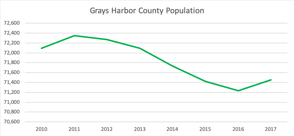
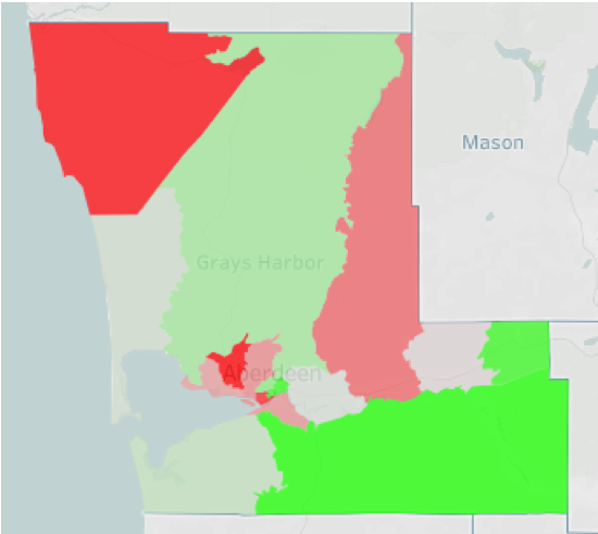
This basic population trend chart fails to capture some of the nuances that are taking place in the region. The map shows that population change from 2010 to 2017 has not been consistent across the county. The population centers of Aberdeen and Hoquiam, as well as the Quinault Reservation and Montesano, have experienced population declines. The eastern part of the county, closest to the I-5 corridor saw the most significant population increase and other coastal regions saw modest gains. Now that we know where population increases and declines are occurring, it’s essential to also look at additional population characteristics.

The population change by age group chart shows that county-wide, it appears that people 54 years and younger are leaving the region and those 55 and older are moving into the region. This represents an interesting demographic shift for the region and raises questions as to why this is happening. It is also relevant for the planning of future resources. The county will need to provide additional healthcare services for their aging population, and school districts may need to realign resources for smaller class sizes. Using the Dashboard to explore other topics such as income and employment trends could help understand why these trends are taking place. Again, these values are for the entire county. What happens when we look a little closer.

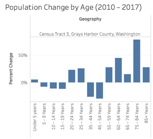
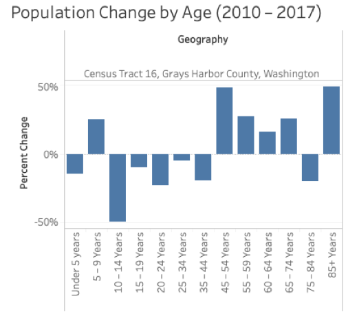
Tract Level Data Analysis

Here are population changes by age group for three different regions within the county. Tract 16 is the southwest corner of Grays Harbor County, which includes Westport and Grayland. This region seems to follow the general county trend.

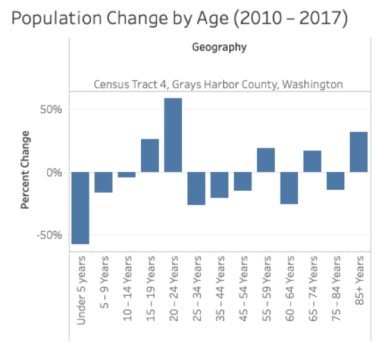
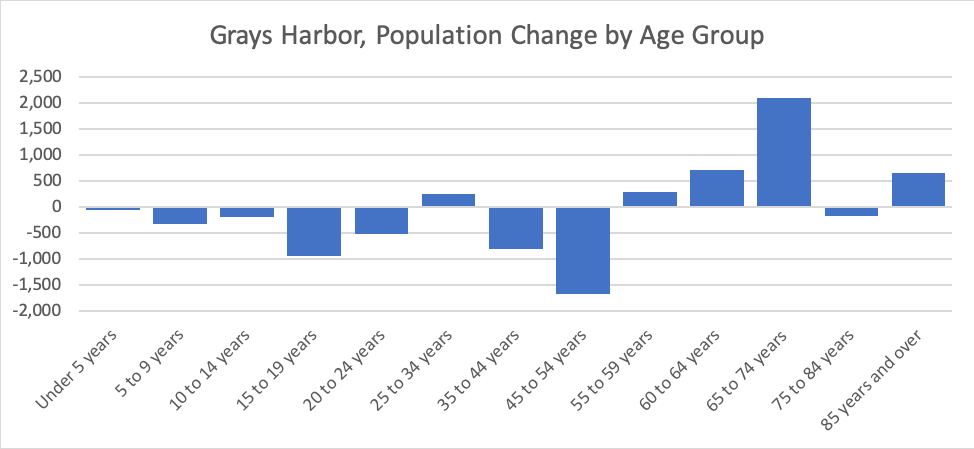
Tract 4 includes Montesano and reaches north and east towards the county line. This region is actually experiencing an increase in the age groups between 15 and 24, decreases in very young children and middle-aged adults, and mixed changes for retirees. The region seems to be attracting young millennials but is losing older millennials with young families.

Tract 3 is the north and central part of the county that is north of the urban centers of Aberdeen and Hoquiam. This rural region has attracted a significant number of retirees but has also gained in younger millennials.
In sum, the Economic Dashboard can help understand local communities and assist with future planning efforts. The account here is just just a small example of how this tool can be used. Please take some time to explore the Dashboard and discover things about your own community. If you have any suggestions or questions, please feel free to reach out to Kevin Decker at kadecker@uw.edu.