August 17, 2022
This year marks Crab Team’s eighth monitoring season, a fact that completely blows our minds. Some of the Crab Team sites have been systematically sampled since we kicked off in August 2015. As this long term ecological dataset grows even longer, it becomes increasingly valuable to look at changes over space and time.
Lest you start to imagine us swimming in our vault of datasheets like Scrooge McDuck, we want to emphasize that the value of these data is not in our file cabinets! As part of a Citizen Science program, we’ve been working hard to not only ensure the quality (check out the Crab Team data lifecycle) and longevity of the data, but we are also working towards making the data more accessible to others, so that they can contribute to all sorts of projects, most of which we never would have imagined!
One of the important steps is creating a data visualization portal, a way for people to get to see what is in the data, and to start to use visualizations as a spark for further investigations and analyses. So we’re pleased to share a big leap forward in this effort: a set of publicly accessible data dashboards featuring the entire Crab Team dataset.
With technical expertise generously contributed by Matt Chadsey, of Non-Linear Ventures, the Crab Team dataset is now accessible via the Tableau public server. Matt worked with Crab Team to create a series of visualizations that summarize and display trap, molt, and transect data in a variety of ways, enabling users to get as granular as desired, and track a single site in detail over time, or to zoom out and look at patterns of abundance and diversity across all sites and years.
These dashboards are meant to be a starting point, a quick condensed look at a few of the many possible relationships of interest that could inspire more formal statistical analyses, or even follow up studies. The dashboards are divided into two main sections:
Click to enlarge screen capture image. Visit Dashboard page to interact.
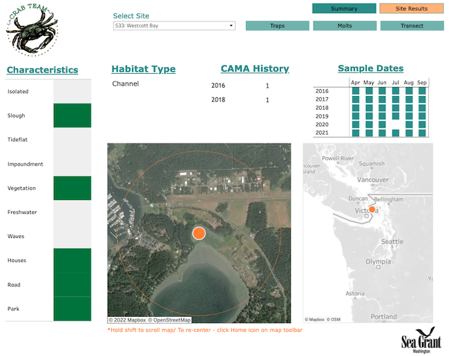
Site Results
Here, the viewer can review all of the data submitted for an individual site, including site characteristics and maps, tables and graphs of trapping and molt data, and transect survey results. You can navigate to specific sites by clicking “site results” in the top right corner. After selecting the site from the “select site” drop-down menu, you can view specific site characteristics, the habitat type and the history of green crab captures from the main menu. For detailed insights into the data collected through Crab Team protocols (i.e. trap, molts, and transect), click the blue tabs in the top right.
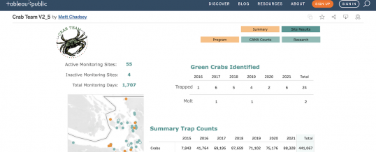
Summary
Click to enlarge screen capture image. Visit Dashboard page to interact.
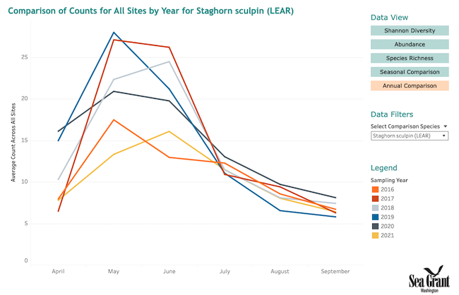
These pages provide a few sample visualizations that synthesize the data across the entire monitoring network, including the overall scope of the program, specific CAMA (European green crab) captures, and a few explorations that might spark deeper investigations, such as tracking abundance of various species across sites, and over the seasons, or looking at how diversity varies across sites based on whether or not green crab have ever been found at those sites. From the “Summary” menu, there are a list of five data views, with options for changing each to target specific comparisons, e.g., comparing abundance of one species, such as staghorn sculpin (in this screenshot to the right) across all Crab Team sites or viewing seasonal comparisons across all species at all sites.
What’s Next?
Being able to visualize the data is also yet another way we can potentially find mistakes or errors that have snuck past all our QC checklists. The first round of review was done by Crab Team staff, and last winter, Crab Team monitors were introduced to Tableau via a winter seminar, during which they explored data from their own site, as well as patterns across space and time. And, because those who collect the data are the most intimately familiar with their sites, we also have benefitted from their eyes on whether we’ve missed any lingering mistakes or typos in the dataset.
So, enough reading about it! The best way to get to know the Crab Team data for yourself is to dive in:
Visit the Crab Team Data Dashboard
Feel free to poke around and choose your own adventure, but if you don’t know where to start, you might check out this suggested exploration guide to help lead you through a few investigations. While the data structure will be most familiar to Crab Team monitors, this data visualization set is for everyone, and we want to hear from you. Find something confusing or possibly in error? Let us know using this Google Form.
Happy [virtual] Crabbing!
–Emily Grason
Check out more Pro Tips on all aspects of the Crab Team protocol.
AUG
2022